Power System Transformation for Dummies
Power system transformation
understanding the challenges
Load duration curve (LDC), residual load and the concept of transformation phases.
Load duration curve
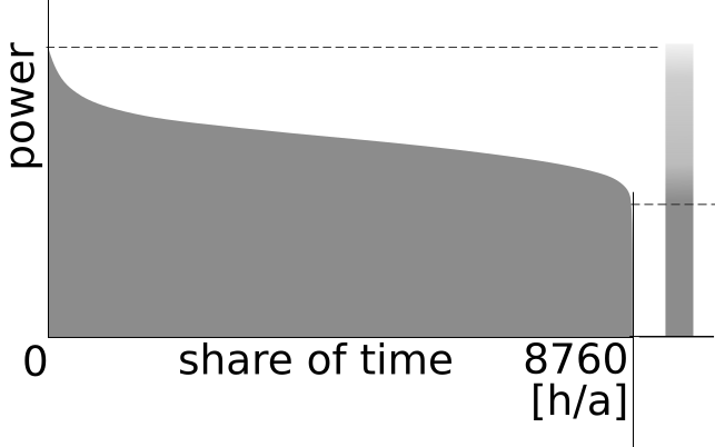
A crucial element of the illustrations used here is the Load Duration Curve (LDC). The LDC visualises the distribution of the load over a certain period, often one year. The LDC is generated by taking the individual load samples from a time series and reordering them from the highest to the lowest value.
The individual samples indicate the power of the instantaneous load, the area below the curve represents the energy in the given period. The highest value, at the left end of the LDC indicates the system peak load, the lowest at the right end the system minimum load. Defining the phases of power system transformation, we use the system minimum load as a parameter.
Because of its simplicity the LDC is an excellent visualisation of load behaviour. Simplicity has its limitations, though. The graph represents a 'copper plate' view of the system and, hence, does not reflect important aspects of power systems:
  • Geography: information about location of generation and load and, hence, the power flows between both is lost;
  • Time: by reordering the time series values, the graph hides gradients and day/night or seasonal cycles;
  • Electrical network: restrictions related to network congestion, voltage issues and all kinds of dynamic requirements are ignored.
Estimates on vRES contributions based on the LDC approach have the tendency to be optimistic. Still, the graphs are instructive here. Their purpose is to illustrate milestones of the transformation process. Not more. Certainly, they are not an attempt to describe quantitative relationships.
Load Duration Curve

Residual load
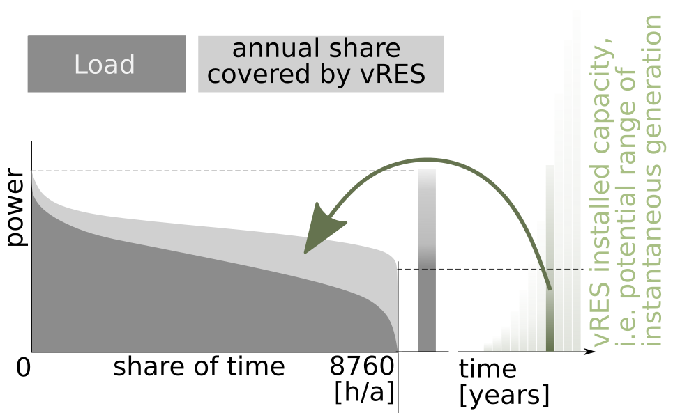
vRES capacities increase over time (see the bars at the right of the graph). At one stage of development, a given vRES capacity supplies a certain amount of the annual load (indicated by the lighter area under the Load Duration Curve matched to one specific capacity by the arrow). The difference between load and vRES generation is called the residual load. The LDC of the residual load can be derived exactly the same way as for the load. The original LDC is shifted down. In the graph, the residual load is the dark area under the LDC. This part has to be supplied by dispatchable generation.
This is the energy perspective.

In terms of power, conditions are more challenging. Even with high vRES capacities installed, there will be many hours they apparently do not contribute to the instantaneous load. (That's why the bar for the installed vRES capacity in the graph is fading out to the top.) Generally, wind and sun are not strongly correlated with load. Also in hours with high load, there may be low vRES generation. Hence, the peak residual load at the left side of the LDC is only slightly lower than the peak load. (Jargon: the 'capacity credit' of vRES is limited.)
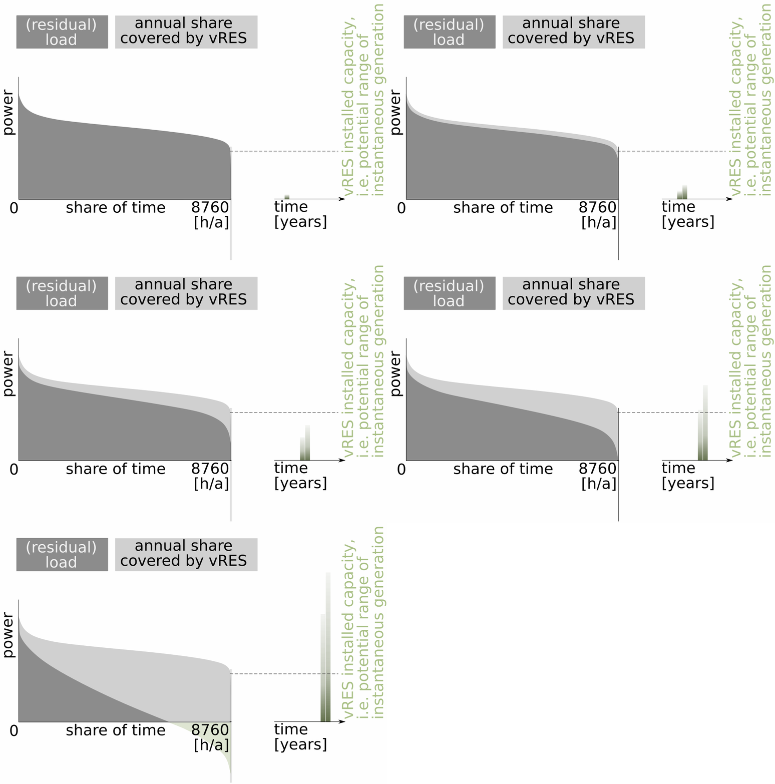
But on a sunny and windy day, instantaneous vRES output may be close to the installed capacity, and, depending on the installed base, may exceed the instantaneous load. In the latter case, the residual load at this moment in time becomes negative. This tendency is visible at the right side of the LDC.

vRES and dRES, both, are based on renewables. It would be logical to also substract dRES when calculating the residual load. From the perspective of vRES integration, however, dRES characteristics are more similar to those of other dispatchable technologies, like thermal generation. For that reason, we decided to substract only vRES when illustrating the phases in the various graphs. dRES are included in the supply from all other dispatchable technologies as part of the residual load. Of course, when discussing a country's conditions and challenges, we treat the matter more subtle.
Residual Load

Phases of Power System Transformation
Our key indicator for distinguishing the phases is the ratio of the nominal installed vRES capacity and the system's minimum load. Let's call this capacity penetration. Capacity penetration is zero when vRES development starts. For most countries, at some moment in time during the transformation process it will be 100%. For systems with little dRES contribution, at the end of the transformation, capacity penetration will be much higher than 100%. The final value depends on the country characteristics and in particular on the availability of dispatchable renewables.

You might argue that this ratio has an academic character. At a power system scale, the complete vRES population never will generate with cumulative installed capacity, certainly not in case of large geographical areas like Russia and certainly not if you consider the cumulated output of wind and solar, each following their own patterns. Realistic values of maximum expected vRES infeed in relation to the system's minimum load seem to be more relevant for defining a phase.
These values, however, differ per country and change over time, because they are strongly influenced by the geographical extension, climate and technology mix. That's why we use installed vRES capacity. This indicator is consistently documented and updated regularly.

phases of transformation - principle

The values of the capacity penetration we propose for distinguishing phases are rough indications. In fact, even the phases are just an attempt to offer a structure.

Describing the phases, each of the values for the capacity penetration is associated with a maximum share of vRES in load coverage. How do we get there? Some extremely simplifying math:
  • Under very favourable conditions, one installed kW of PV generates about 2000 kWh. Some extreme places in the world, like the North-West of Argentina offer a bit more, most regions significantly less. In other words: PV provides up to 2000 full load hours. Given the fact, that one year has 8760 hours, one could say that one kW of PV - at the best loactions in the world - permanently provides slightly less than 25% of its installed capacity. For an impression how realistic this is, take a look at the Global Solar Atlas.
  • Similarly, very good onshore wind sites allow an annual yield of 3500 to 4000 full load hours. Again, there are extreme cases like the West coast of Ireland or Patgonia with higher potential. Also for offshore wind, this figure may even be higher. Let's translate this to an extremely optimistic average value of 40% of the installed capacity generated permanently. For an impression how realistic this is, take a look at the Global Wind Atlas.
  • As you see, the value between wind and solar PV differs substantially. We cannot simply add up their capacities. Even a very indicative guess of the annual yield of the mixture would require weighting their shares. We need one value for all countries, though. We ignore details and just assume that the annual energy yield of the technology mix is 20% of the cumulated installed capacity.
  • Finally, let's put this in relation to load coverage. With our assumptions, a capacity penetration of 100% covers 20% of the permanent minimum load. Depending on the specifics of a country, the permanent minimum load corresponds to something between 50% and 70% of the total annual load. This means that a capacity penetration of 100% may contribute 10% to 15% of the annual load - and any fraction proportionally less.
We simply take a fixed factor of 12%. For many countries this is quite an optimistic guess. If capacity penetration gets larger than 100%, system residual load sometimes may become negativ and, potentially, not every kWh of electricity generated can be absorbed by the load. Starting from these penetration levels we reduce this the 12% value manually based on experience.

Of course, all this is a very rude mix of very rude assumptions. It not just generalises and in many cases probably overestimates resource characteristics. The assumptions also completely ignore all kind of constraints of the power system. Not every kWh generated by vRES can be absorbed. This is obvious once the installed capacity is higher than minimum load. But also much earlier, there may be restrictions introduced by network congestion or operational requirements for the dispatchable generation.

So, why do we provide these, potentially misleading figures for renewable shares in the annual load coverage? For distinguishing the phases they are not necessary. - It is for making the phases tangible. Targets for renewables policies, in most cases, are not set in terms of installed capacity but as shares of supply. This is what policy makers and the general public understand. This gives a feeling what has been achieved by passing a phase. This is what counts in the context of climate policies. Numbers may be highly inaccurate - the feelings often are the essence of the political debate. Among others, this is what we want to contribute to with this site. ;-)

If you are convinced that the values describing the phases or even the relevant phases themselves have to be defined differently in your country, probably, you are absolutely right.

Load Changes, Flexibility and Storage Overview Phases Dispatchable Renewables